 Custom Mailer Boxes
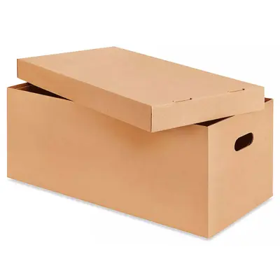 Custom Shipping Boxes
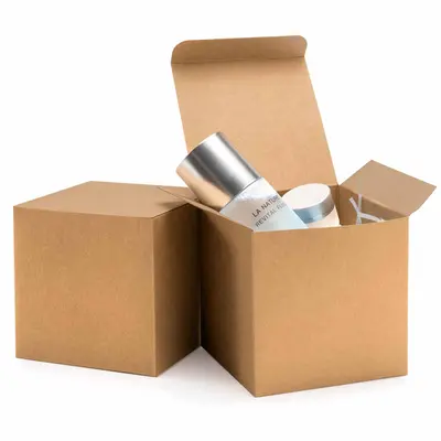 Custom Cardboard Boxes
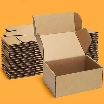 Custom Kraft Boxes
 Custom Product Boxes
 Custom Retail Boxes
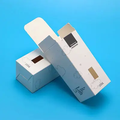 Custom Tuck End Boxes
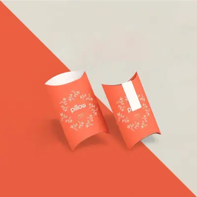 Custom Pillow Boxes
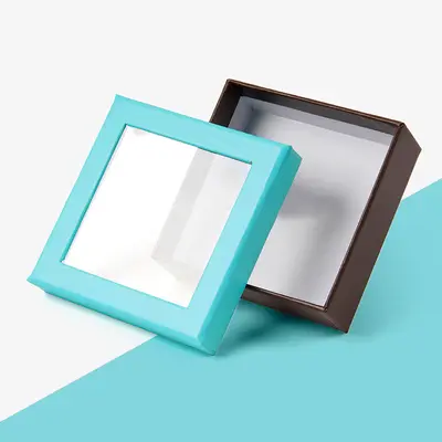 Custom Window Boxes
 Custom Rigid Boxes
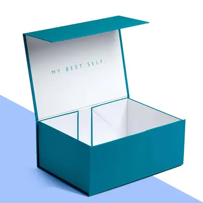 Custom Gift Boxes
 Custom Magnetic Boxes
 Custom Sleeve Boxes
 Custom Printed Boxes
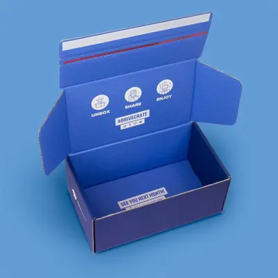 Custom Boxes with Logo
 Custom Box Inserts
Print: How Many Colours?
Box print falls into three broad levels. 1 colour print uses a single ink, usually for a logo or simple line artwork. It is the most economical option and looks especially good on kraft board. 2 colour print adds a second ink, for example a logo in one colour and a web address in another. Full colour print builds images from four process inks and can reproduce photographs, gradients and complex patterns.
| Best for | Works on kraft? | |
|---|---|---|
| 1 colour | Logos, simple marks | Yes, in dark inks |
| 2 colours | Logo plus text or accent | Yes, in dark inks |
| Full colour | Photos, patterns, illustrations | Possible, colours look softer |
If your brand uses a specific colour, spot colours can be matched to a Pantone reference on request. Logos printed in one or two spot colours are covered on our logo printed box options page.
Inside, Outside or Both
Most boxes are printed on the outside. Printing the inside as well adds a second pass, but it can transform the moment the box opens. A popular approach on printed E flute mailer boxes is a simple logo outside and a full colour pattern or message inside. It keeps the parcel discreet on a doorstep and makes the unboxing memorable.
Lamination: Matt or Gloss
Lamination is a thin film applied over the print. It protects the surface from scuffs and moisture, which matters most for boxes that travel through the post. Matt lamination gives a flat, low-glare finish that reads as calm and modern. Gloss lamination makes colours richer and shinier, and wipes clean easily. Gloss suits bright retail packaging; matt suits most other boxes. Shelf cartons such as printed retail boxes for shops often take gloss.
Soft Touch
Soft touch is a special laminate with a velvet-like feel. It is very popular on rigid and magnetic boxes and on dark designs, where it gives a deep, even colour. It is chosen as much for how the box feels in the hand as for how it looks, which is why it appears on so many magnetic closure gift boxes.
Spot UV
Spot UV is a clear, glossy coating applied to one area only, such as a logo or a pattern, usually over a matt background. The contrast between matt and gloss catches the light as the box moves. It is subtle in photos and striking in the hand. Spot UV is one of the options on full colour printed boxes.
Foil
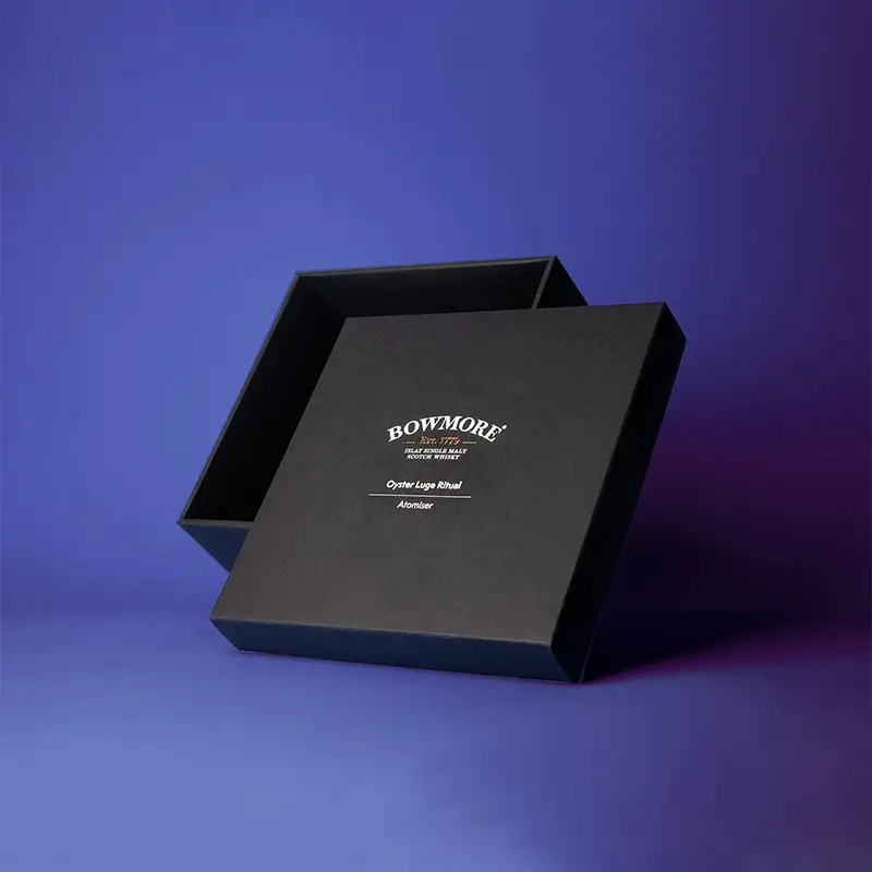
Foil stamping presses a thin metallic layer onto the board with heat. Gold, silver and copper are the usual choices, and foil looks particularly good on dark board, soft touch and kraft. It is best kept for one detail, typically the logo or a border, so it reads clearly. Foil on kraft is a common choice for brown kraft boxes with a logo.
Embossing and Debossing
Embossing raises part of the design above the surface, so it can be felt. Debossing presses it in. Both work best on thicker board and on rigid boxes, and both combine well with foil for a logo that is both shiny and raised.
On corrugated mailers, a light emboss on the lid can work, but the flute underneath limits fine detail. Keep embossed shapes bold and simple there, and save delicate lettering for rigid boxes and thick card, where the edges stay crisp. See luxury rigid boxes with embossing for examples.
Finishes Side by Side
| Finish | What it does | Best on |
|---|---|---|
| Matt lamination | Flat, protective, low glare | Most boxes |
| Gloss lamination | Shiny, richer colour | Retail and product boxes |
| Soft touch | Velvet feel | Rigid, magnetic, gift boxes |
| Spot UV | Gloss highlight on one area | Logos and patterns over matt |
| Foil | Metallic shine | Logos, names, borders |
| Embossing | Raised detail | Logos on rigid boxes |
See photos of each finish on our board and finish photo page.
Matching Finish to How the Box Is Used
A box that travels by post faces scuffs, rubbing and the occasional damp doorstep, so protection matters more than sparkle. Matt or gloss lamination is the sensible base, and a single foil or spot UV detail is plenty. A box that lives on a shelf is handled by shoppers, so gloss for colour or soft touch for feel both earn their place. A rigid gift box is about the moment of opening, which is where embossing and foil together are most worthwhile.
Think about colour too. Soft touch deepens dark colours and can mute pale ones. Gloss makes bright colours brighter. Kraft board with no lamination keeps its natural texture, and a copper or gold foil logo suits it well. Printed labels and sticker seals can carry the same finish to the rest of an order.
Checking Print and Finish on the Proof
Your free design proof shows each printed panel flat, with notes marking where finishes go. Check that the foil or spot UV areas sit exactly on the logo or detail you intend, that small text is large enough to read, and that important elements are clear of folds and edges. Colours on screen are a guide; if a brand colour must be exact, ask for a Pantone match when you request the custom quote. You can also try placement first with the Design Your Box preview.
How to Choose
Start with protection: if the box travels, matt or gloss lamination is a sensible base. Then pick one feature finish for the logo: foil for shine, spot UV for contrast, embossing for touch. Two feature finishes together can work on a rigid box; more than that tends to look busy. The custom quote lists each finish separately so you can see what each adds. Our guide to how custom box pricing works explains the rest.